Case Study
Client: The Online Jewellery Company (OJco)
Industry: Jewellery / Retail / eCommerce
Role: Senior Graphic Designer & Brand Art Director
Deliverables: Brand identity, eCommerce design, digital advertising, retail branding, photography direction, packaging, and in-store marketing
The Challange
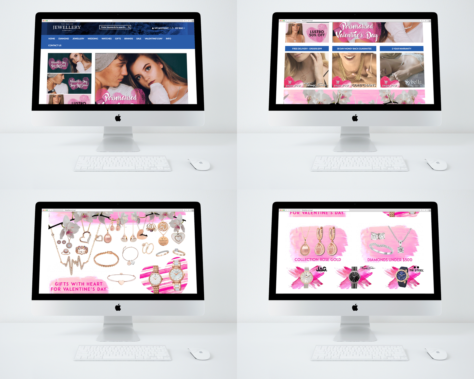
OJCO (The Online Jewellery Company) needed a complete rebrand to modernize its image and create a stronger emotional connection with its customers. The brand had grown online but lacked a clear identity and consistent visual communication. Their existing design didn’t reflect the quality and elegance of their jewellery, and they wanted to establish a more cohesive digital presence before expanding into a physical space.
The Process
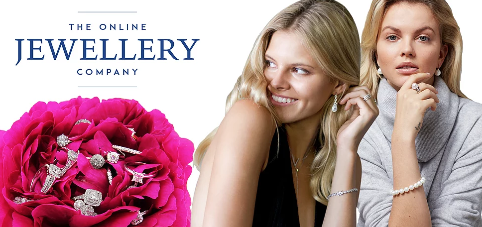
I began by analysing the brand’s positioning, audience, and competitors to understand where OJCO could stand out. From there, I developed a new logo and visual direction that balanced sophistication with accessibility.
.
To support the new branding, I worked on:
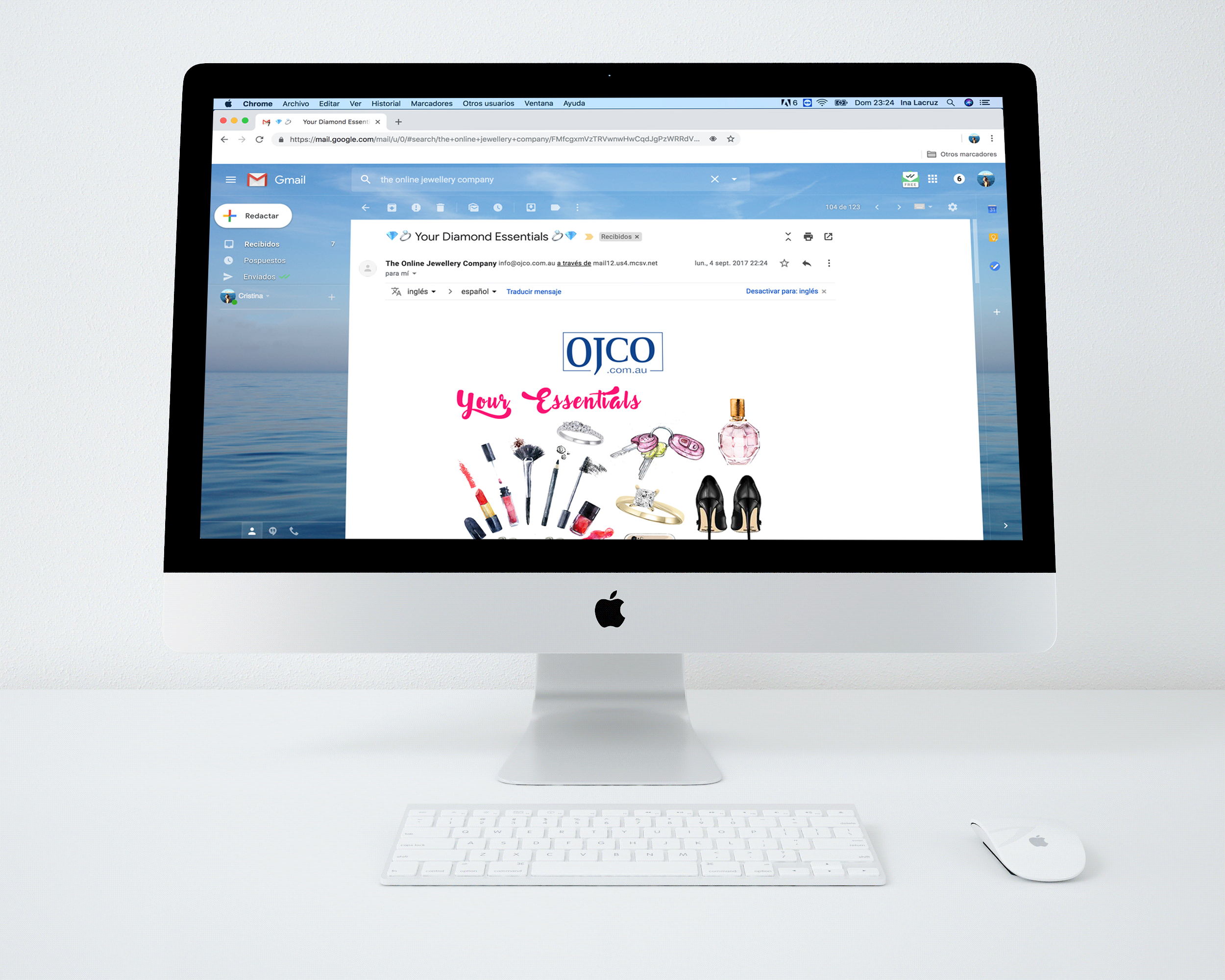
- Designing EDMs (email campaigns) to communicate promotions and updates effectively.
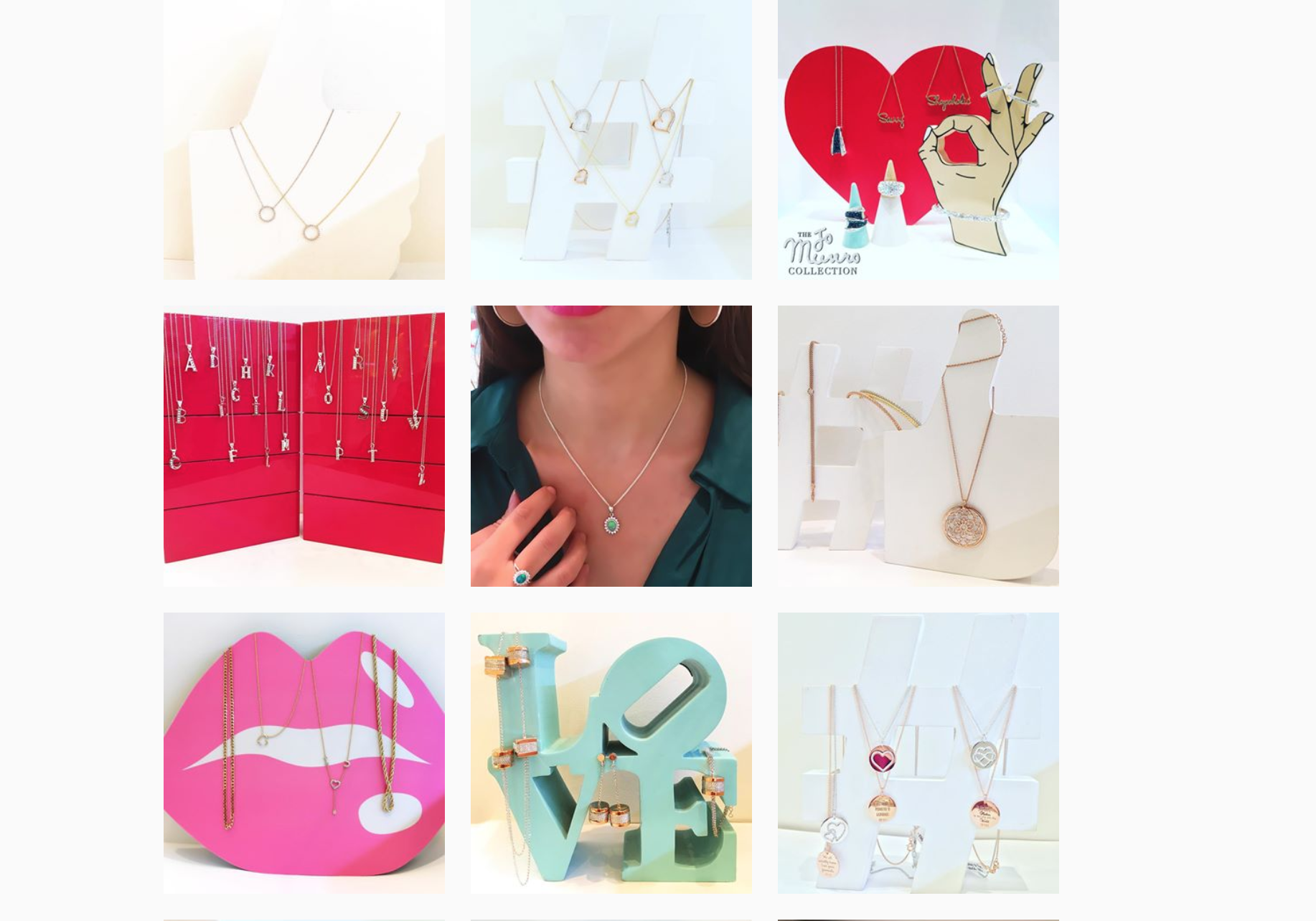
- Assisting with social media strategy and content, ensuring a unified visual style.
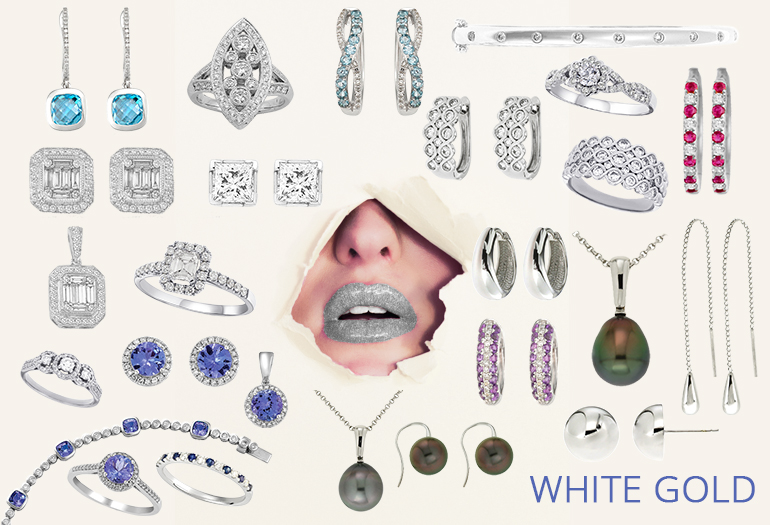
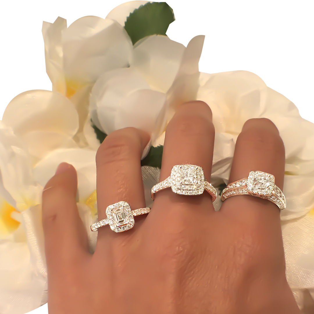
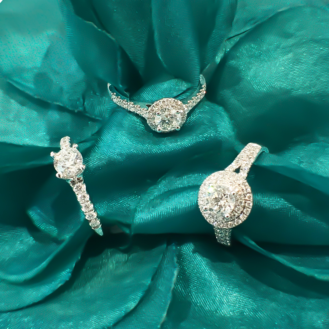
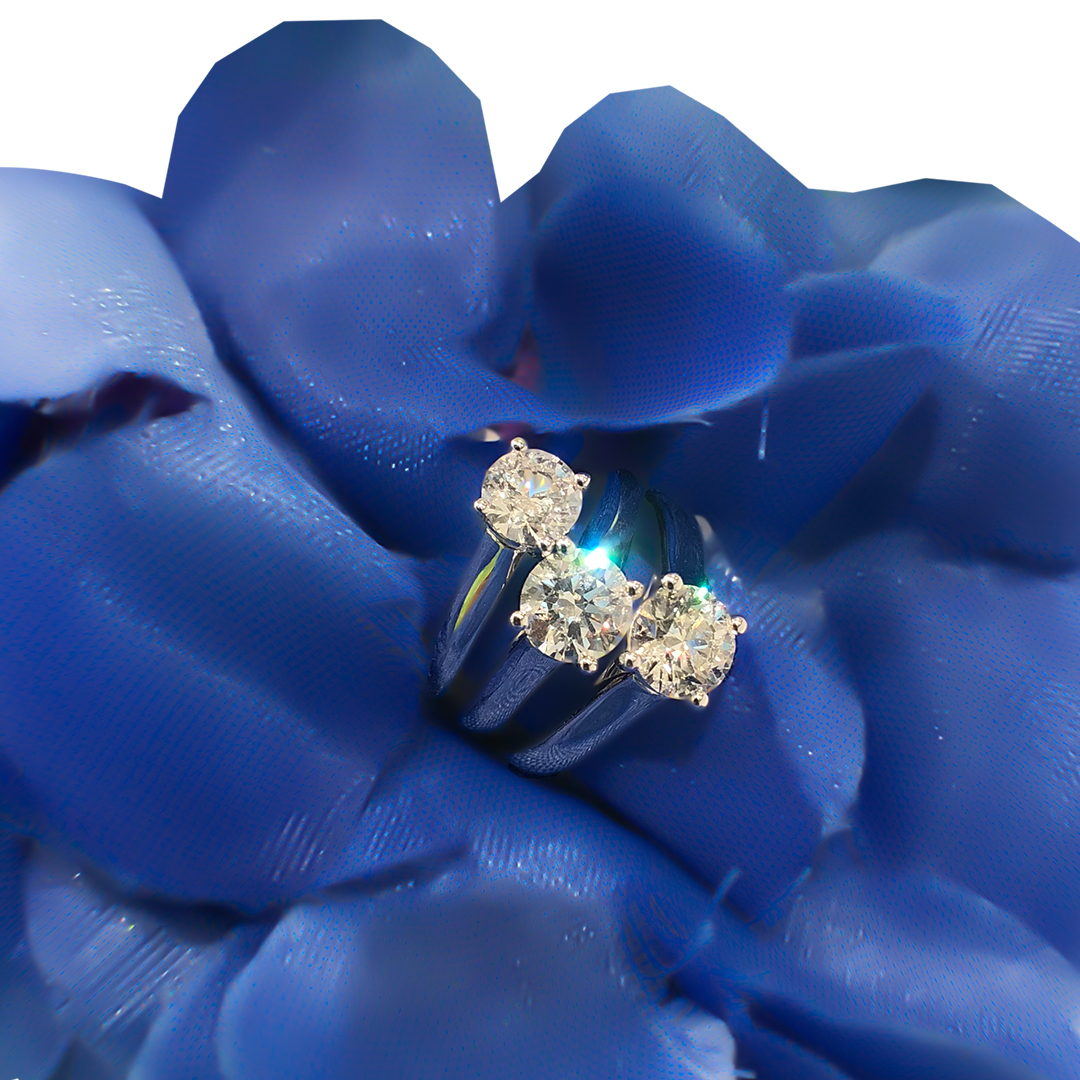
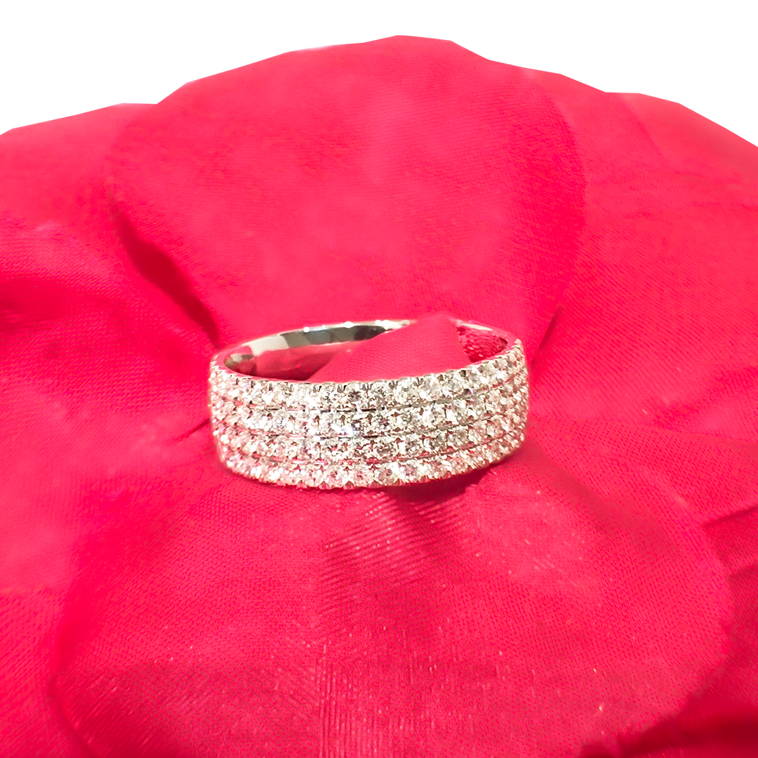
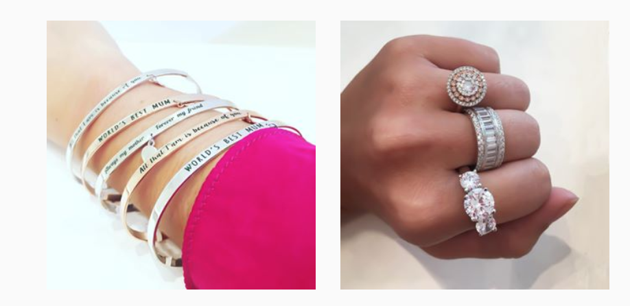
- Taking and retouching product photography for the website and marketing use.
- Creating visual guidelines to ensure consistency across all digital platforms.
Throughout the process, collaboration with the marketing and photography teams helped align visuals with the brand story and tone.
The Outcome
The new OJCO identity gave the brand a refined, modern look that resonated with its audience. The refreshed logo, cleaner imagery, and cohesive digital presence helped the company strengthen trust and recognition online.
The Impact
The rebrand prepared OJCO for its next chapter — evolving from an online-only store into a physical retail experience. The consistent branding also helped improve customer engagement through email and social media campaigns, supporting growth and customer loyalty.
✉️ Email Marketing Redesign (EDMs)
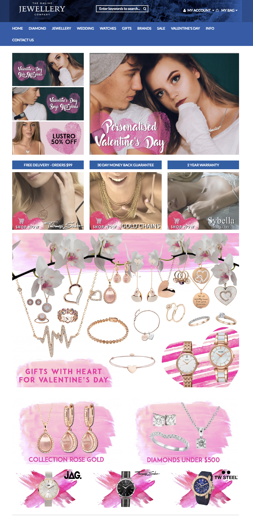
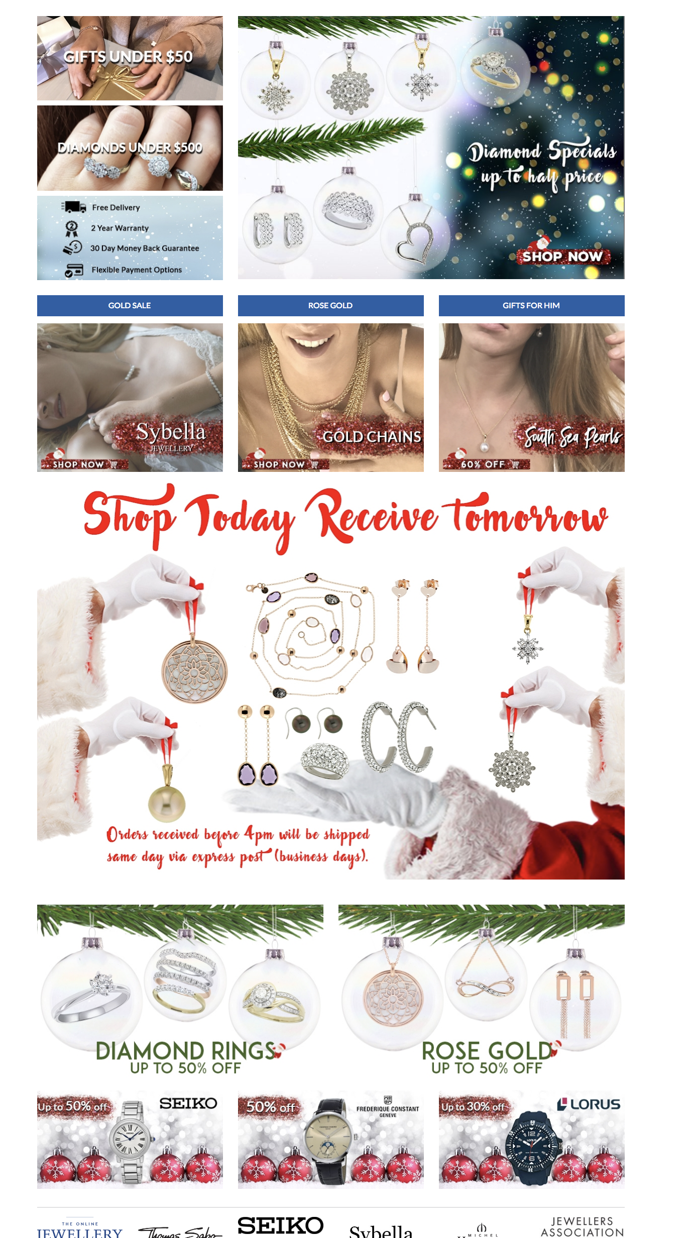
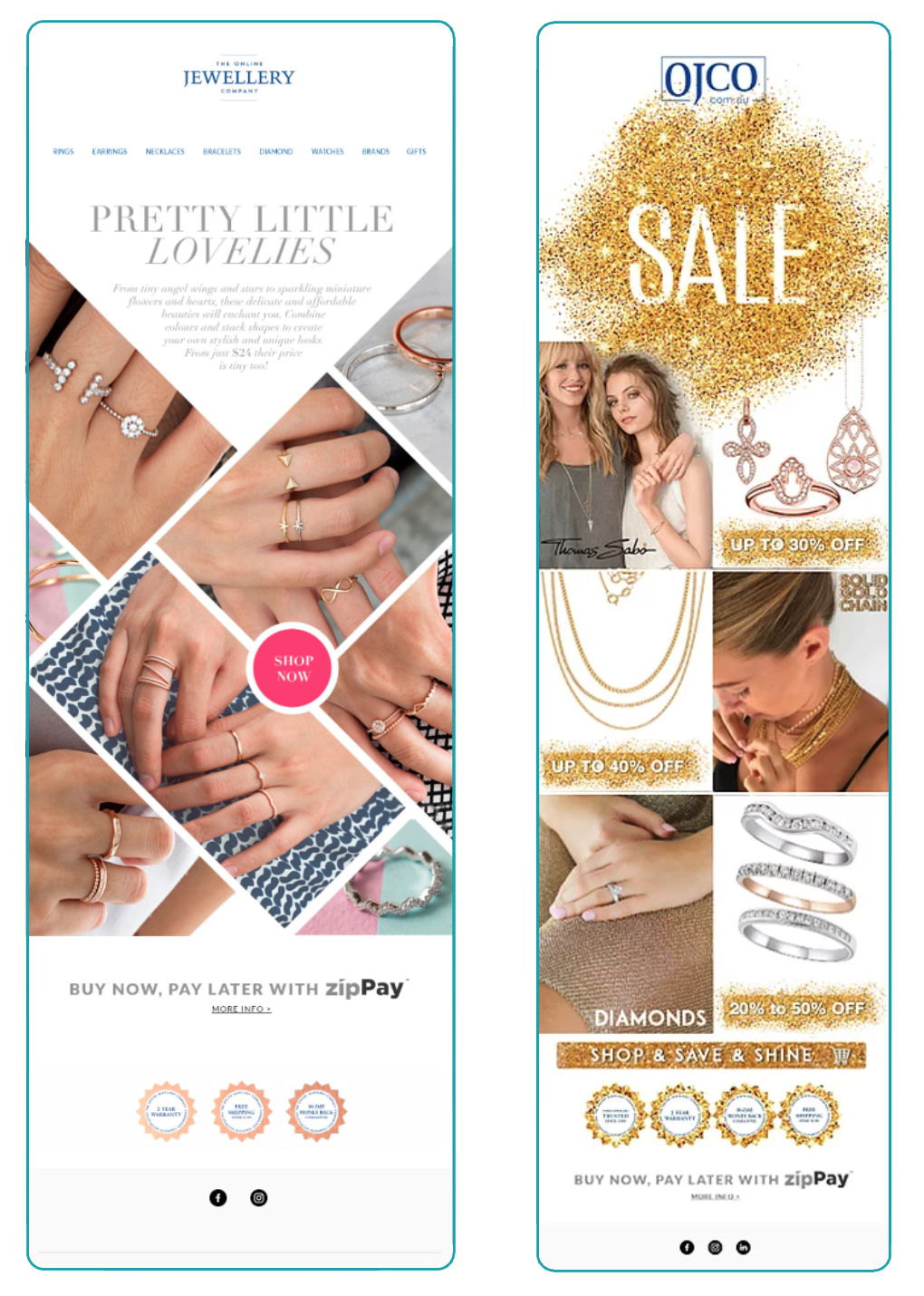
Throughout the evolution of the brand, we transformed the email marketing strategy three times — aligning design and tone with each new stage of the company’s identity.
The original EDMs were long, text-heavy, and included the full website menu at the top, which distracted readers from the featured products. We began by redesigning the newsletters with a cleaner layout, focusing on visual storytelling and key promotions instead of large text blocks.
When the brand evolved into The Online Jewellery Company’s new look, the EDMs adopted the updated logo, typography, and color palette — offering a more cohesive and elegant visual experience.
Finally, with the transition to Paddington Jeweller, we refined the style even further: shorter copy, sophisticated imagery, and minimalist design that reflected the new boutique identity. Each version improved engagement and conversion rates, turning the EDMs into an essential sales and branding tool.

💎Brand Evolution – From OJCO to Paddington Jeweller
The brand underwent three key transformations to align with its growth — from a national online retailer to a refined local boutique experience.
We started with The Online Jewellery Company logo — a classic typographic mark that communicated trust and accessibility for the eCommerce market. As the brand grew, it evolved into the shorter, modern OJCO abbreviation. This version represented a more confident, design-focused direction while maintaining recognition among existing customers.
When the physical store opened in Paddington, we reimagined the identity entirely. The new Paddington Jeweller logo introduced an elegant shell icon — a symbol of natural beauty, timelessness, and connection to the coastal heritage of Sydney. The refined typography and subtle iconography elevated the brand into a boutique aesthetic while keeping a link to its digital roots through the website ojco.com.au.
This progression reflects a journey of refinement — from digital beginnings to a personalized luxury experience, supported by a cohesive, evolving visual language.
TECHNICAL SKILLS
Illustrator
Photoshop
COPYRIGHT
The Online Jewellery Company
Sydney (Australia)
Skills Used
“She is very diligent and talented and the calibre of her work was very high, both creatively and technically. Cristina displayed an excellent understanding of her chosen discipline and made a significant contribution to our marketing campaigns from concept through to execution on email, on social and within the store. Cristina had a high regard for the overall success of our business and was always willing to contribute in areas that were not within her job description, from stock selection, housekeeping and on the floor sales. In addition, Cristina was always willing to do urgent work even out of normal business hours. I would not hesitate to re-employ Cristina should the opportunity arise. I wish her great success in her future endeavours.”


